


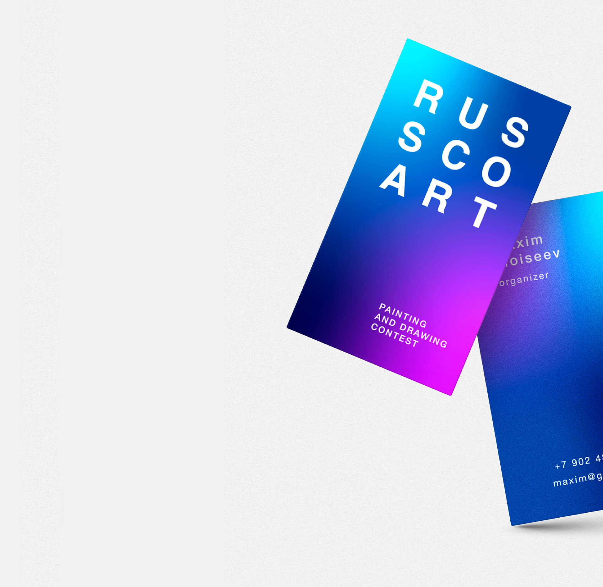
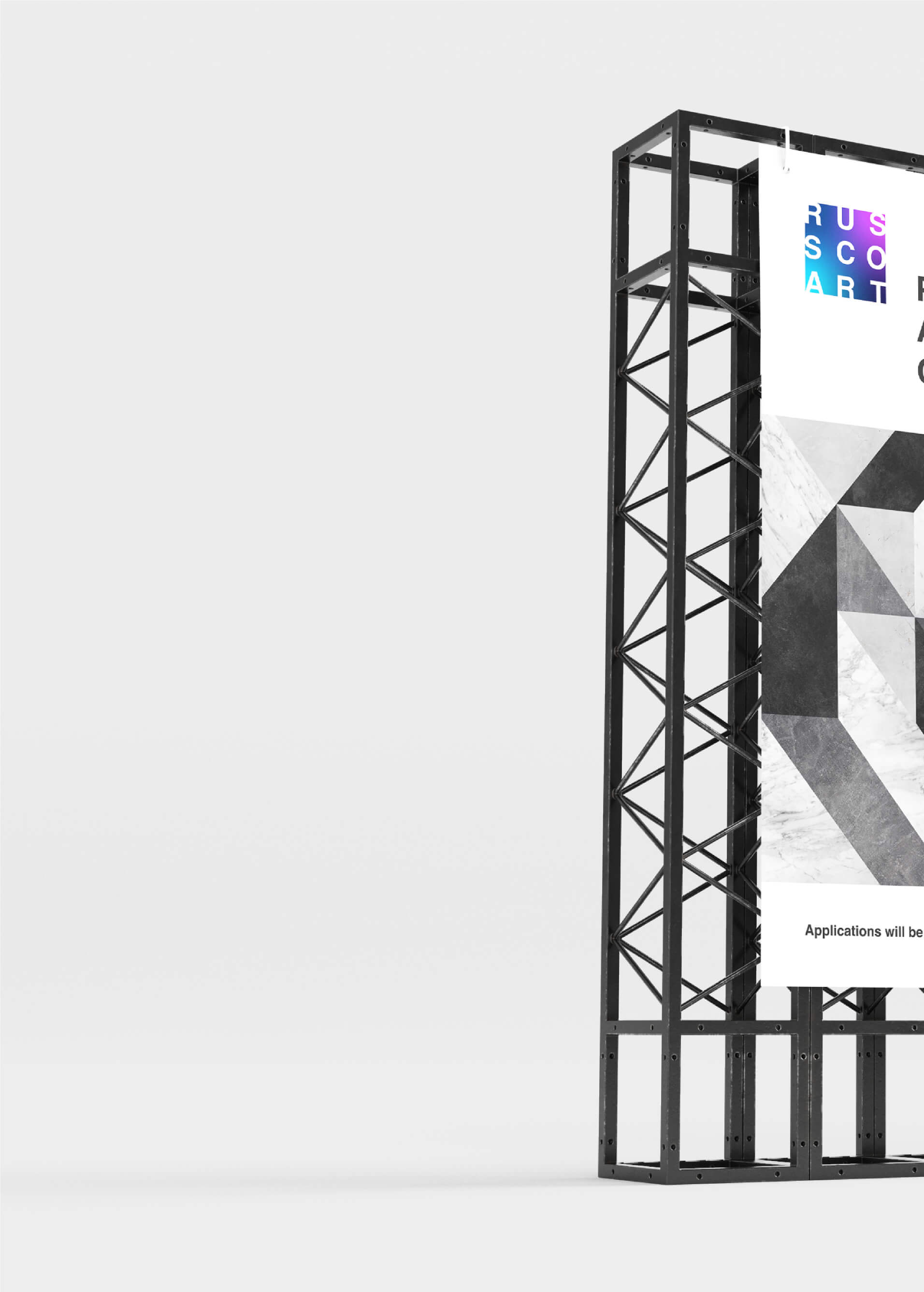
Brand identity of the RUSSCOART international painting and graphics contest
RUSSCOART
Next project
Svadba v Oblomovke
Svadba v Oblomovke
Previous project
Paleontological Museum
Paleontological Museum
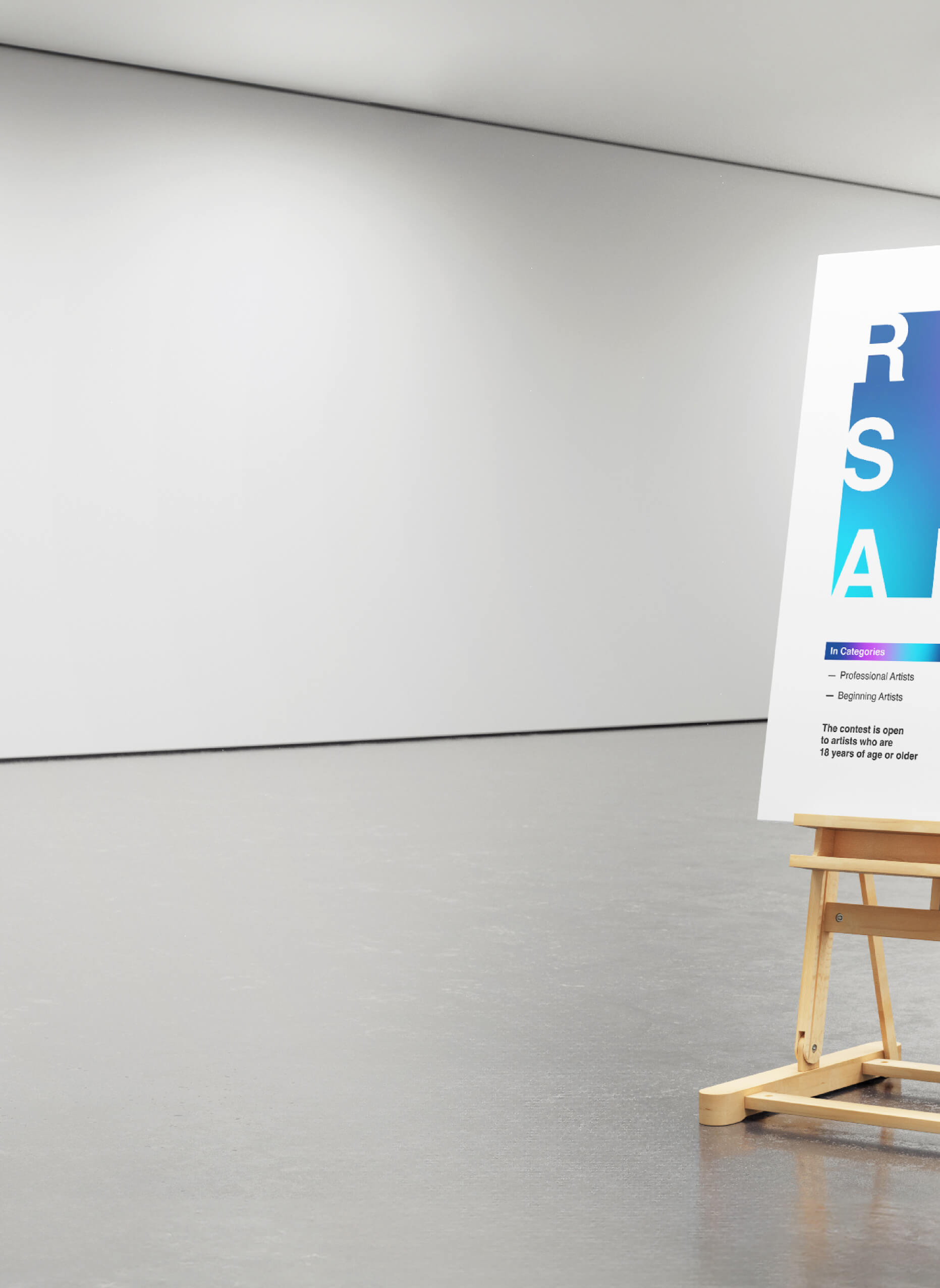
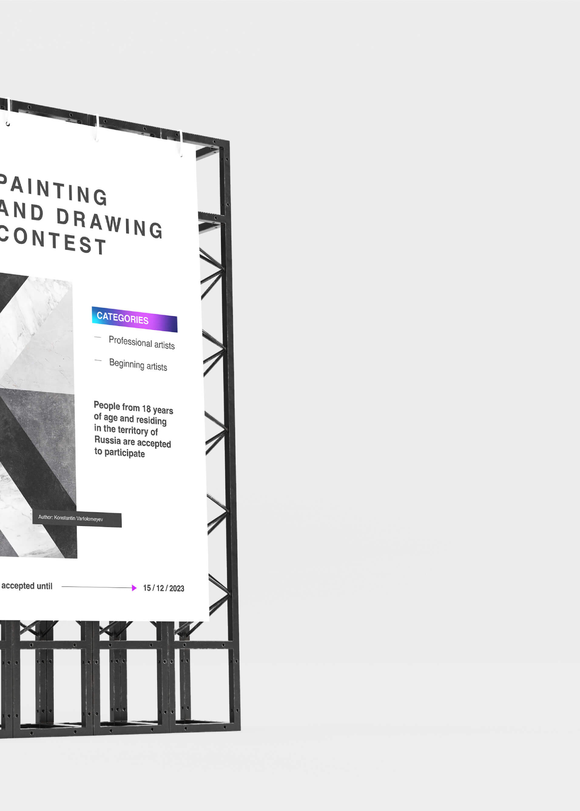
objectives
of the competition
of the competition
RUSSCOART — a competition projectin painting and graphics within the framework of the association of Art-centre Exposed and ARS Gallery


Painting and graphics

Beginners and professional artists
Promoting the development of creative abilities

Finding and supporting talented people
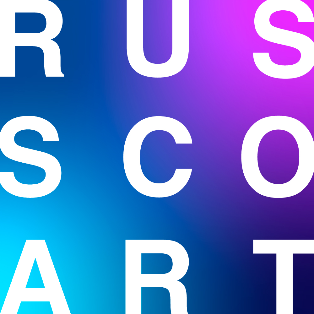
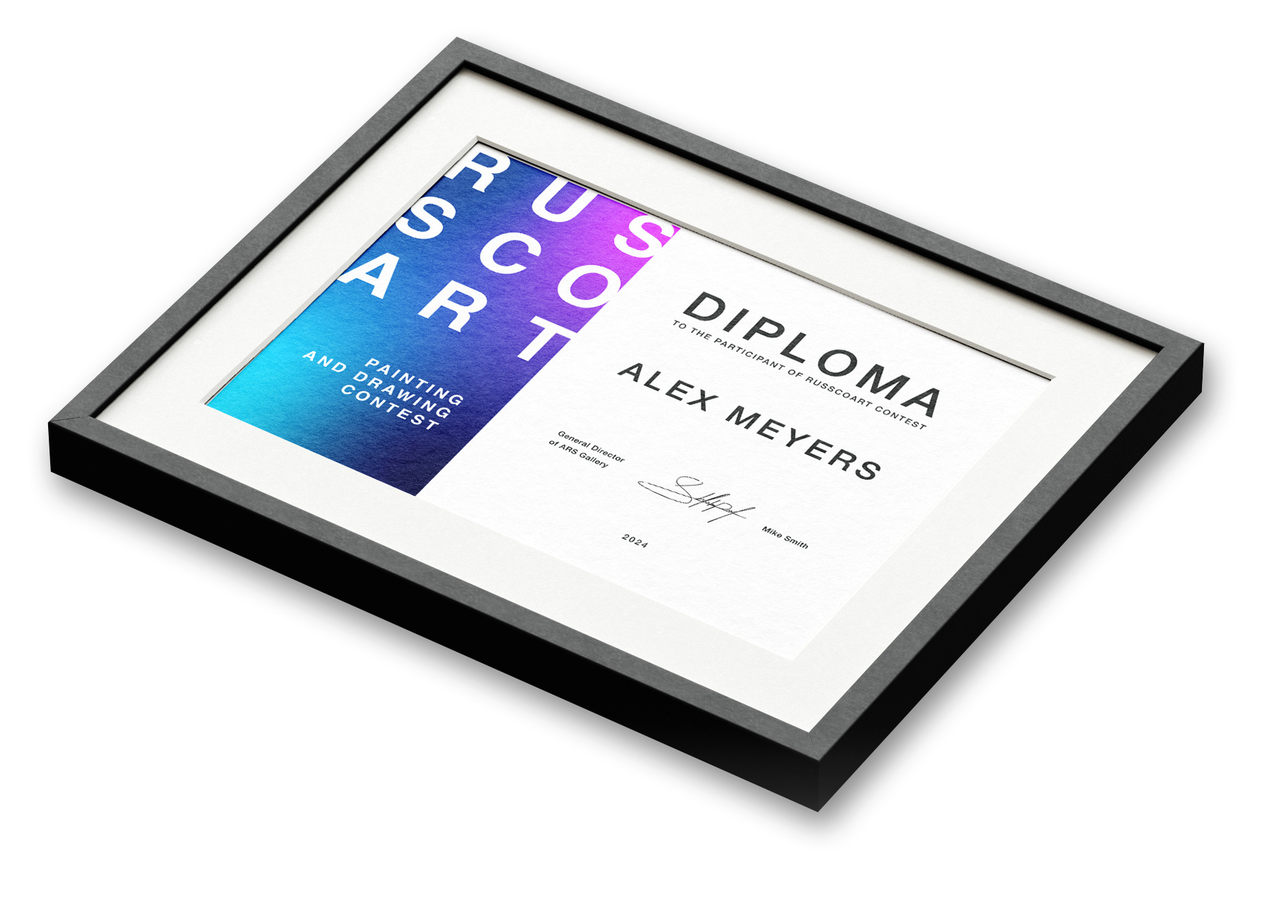
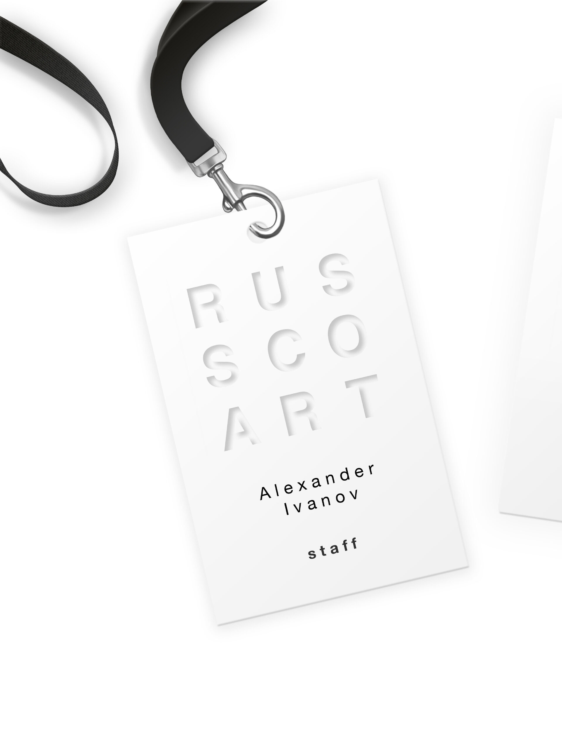
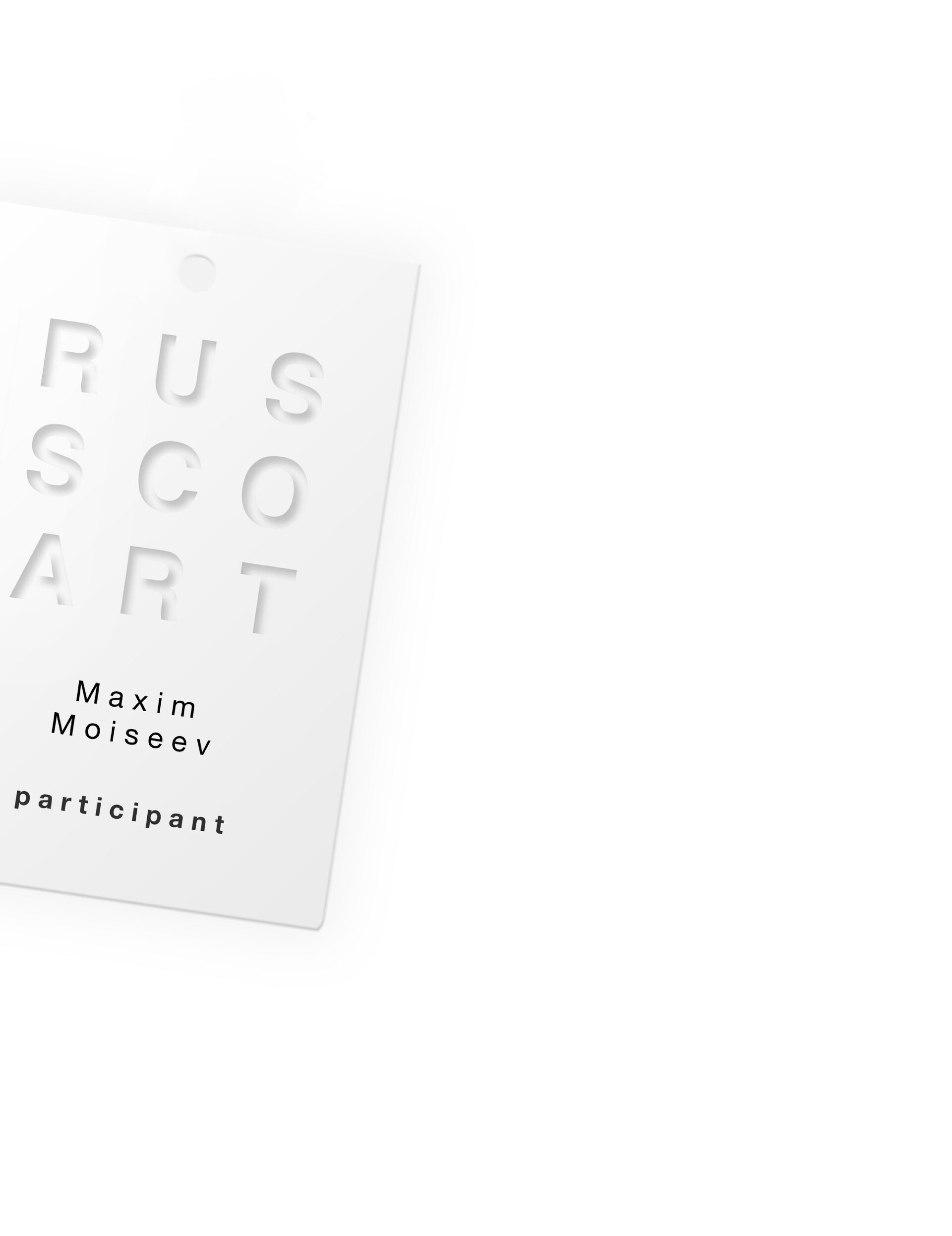
LOGO
SEMANTICS
The mix of colors in the logo is based on the theme of uniting two countries, two galleries, mixing cultures, techniques and views of the organizers and participants of the competition.
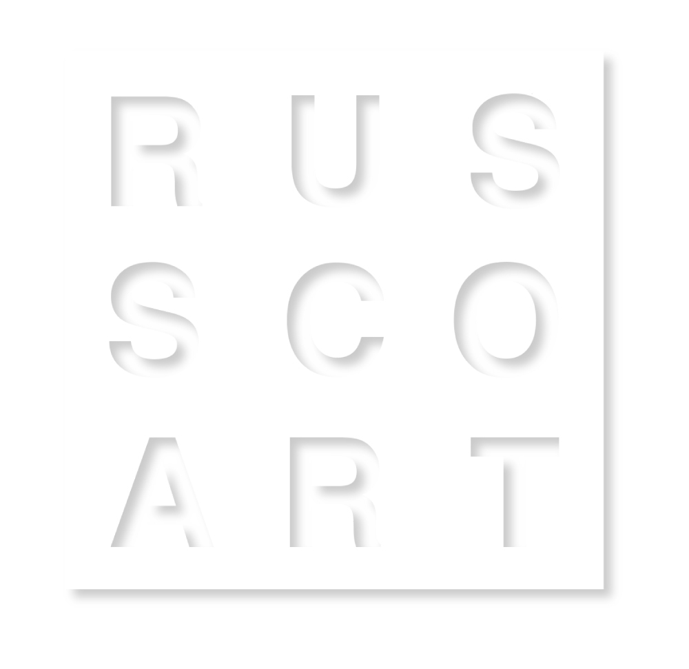
The white typography in a square references foundational images in art - painting, frame, “white cube” gallery.
The white typography in a square references foundational images in art - painting, frame, “white cube” gallery.
COLORS
The main version of the logo uses a dot gradient consisting of 4 colors
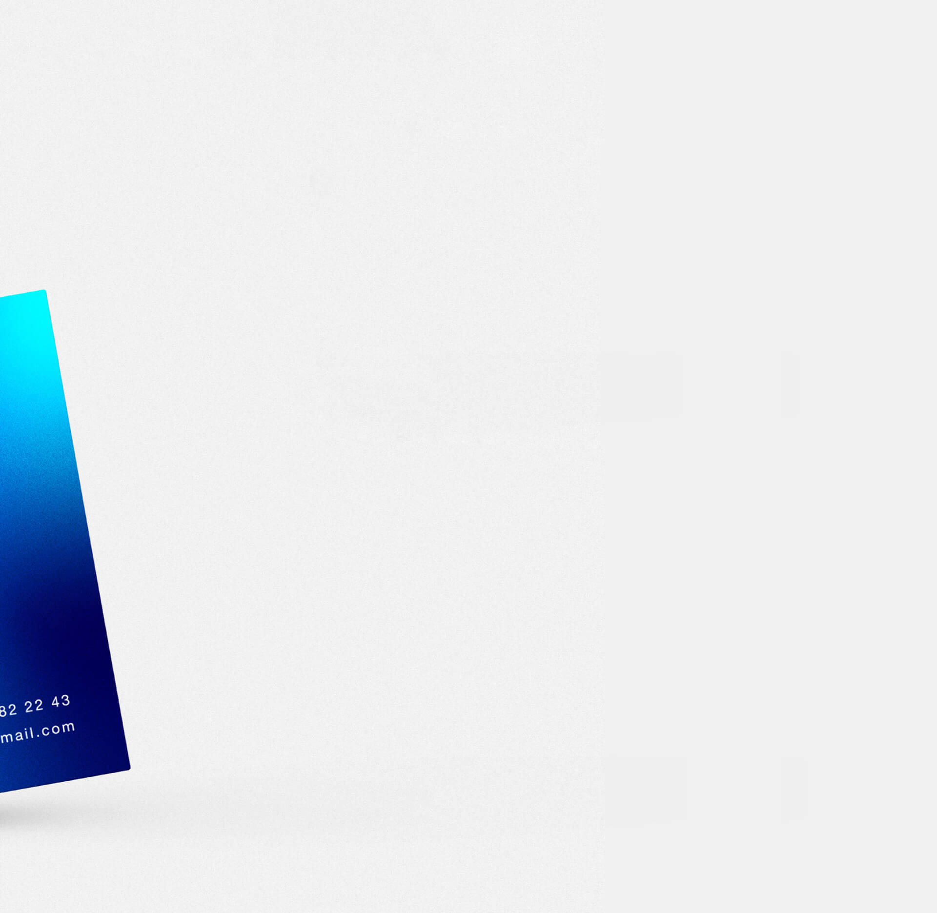
The name of the RUSSCOART contest is written in white color
The name of the RUSSCOART contest is written in white color

MONOCHROME
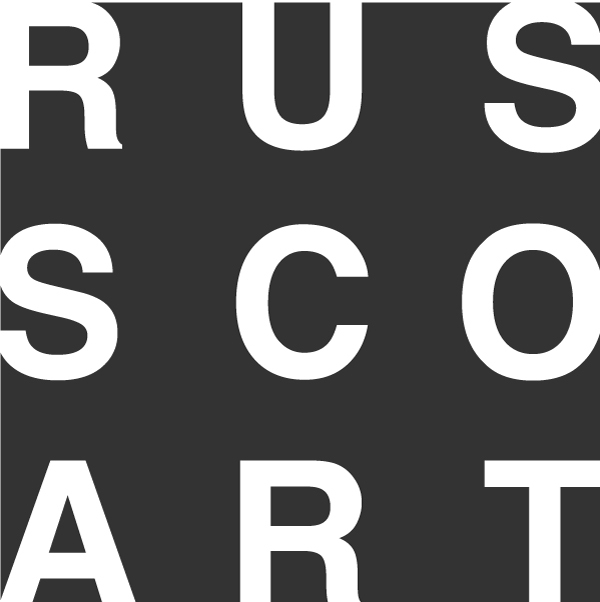

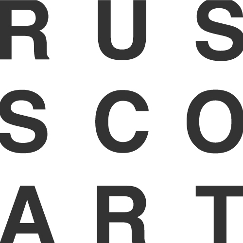
The monochrome version can be used with dark gray text on a white background and inversion
51/51/51
69/60/56/66
69/60/56/66
#333333
255/255/255
0/0/0/0
0/0/0/0
#FFFFFF
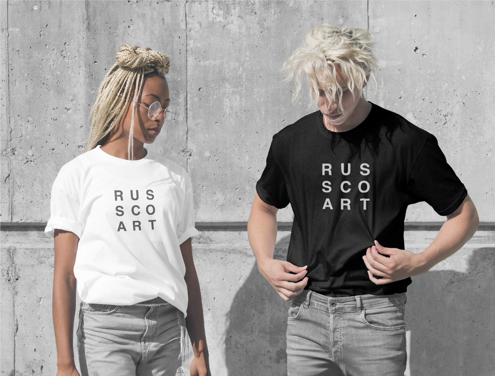
ALTERNATIVE VERSIONS
TYPOGRAPHY
The logo uses the Helvetica font family, in bold typeface
Light Back
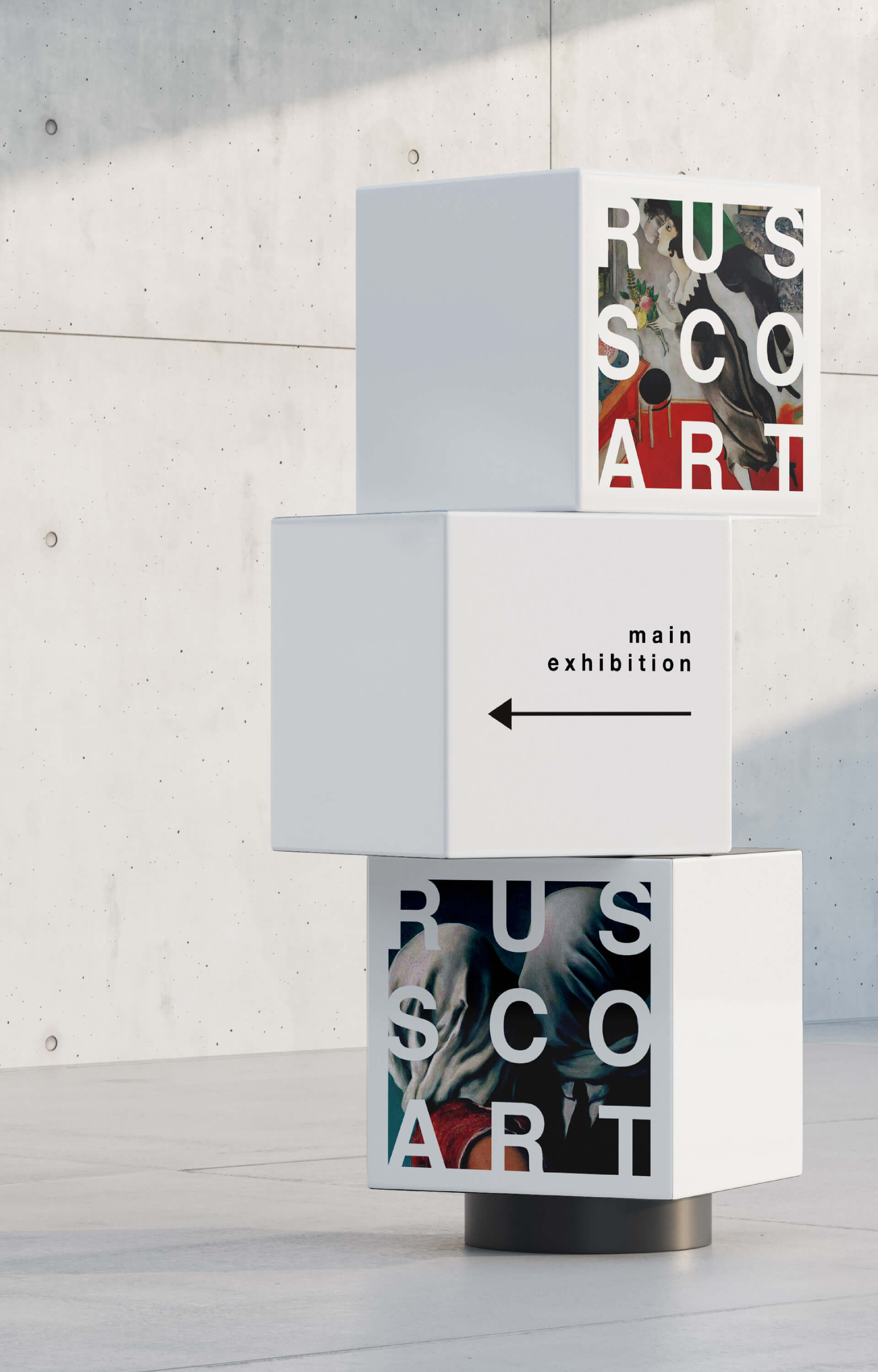
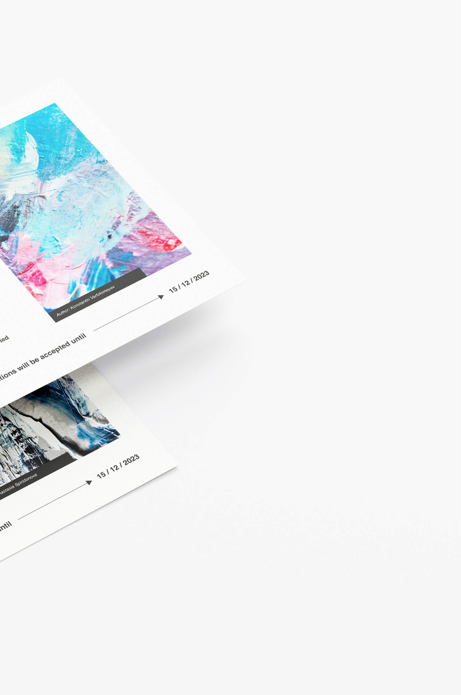
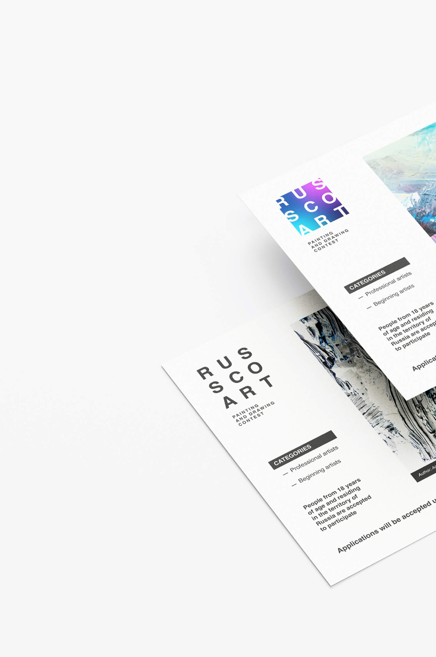
World works of art on the background
The background of the logo can be replaced with an image of paintings. For example, it can be the work of a contest participant
ADDITIONAL VERSIONS
Various options were presented during the logo design process


An alternative version of the logo may use a white die with a dark graphite colored outer shadow
Next project
Next project
Svadba v Oblomovke
Svadba v Oblomovke